
Ch 2: A Haves and Have Nots World
A much greater hunger
In 1800 the world’s population was about 1.36 billion. If we are to believe statistical analysis, most people lived, in income terms, relatively similar lives. According to Gapminder statistical analysis (admittedly conjectural, given that data before 1900 is ‘highly uncertain’) the world’s poorest countries in 1800 (most of them in Africa) had average incomes around $US 340 (Cape Verde) to $US 800 (Mauritius) a year, while the world’s two richest nations were the United Kingdom ($US 2,717 per capita) and the Netherlands ($US 2,412). Both of these are of course in Western Europe. The US (the world’s third richest country) had an average income of $US 1913. These statistics (all dollar figures are adjusted for inflation to 2005 purchasing power figures) indicate that a person in the poorest country (Cape Verde) is 7.99 times poorer – on average – than a person in the richest, the United Kingdom. A gap exists but it is not that statistically significant. Most of the world’s wealthier countries are in Europe. Japan has an average income of $US 1055, China’s average income is $US 986, Australia’s is lower at $671, while India’s is $US 563…
In 2010 (population just under 7 billion), a person in the world’s richest country (Qatar – ah, the joys of oil wealth) had an average income of $US 93,818, while a citizen of the Democratic Republic of The Congo, the world’s poorest country, had an average income of $US 387. As such, a citizen in the Congo is 242.42 times poorer than a citizen of Qatar (and 80.95 times poorer than an average citizen in the UK, where the average income in 2010 was $US 31,330). The gap between rich and poor, between the ‘haves’ and the ‘have nots’ has become statistically significant. (See Gapminder’s interactive graph Wealth and Health of nations at http://www.gapminder.org/world/ for a visualisation of the statistical development of this haves and have nots world.)
OPINION BOX:
Fitzgerald, F. S., (1925), The Rich Boy, retrieved from http://ebooks.adelaide.edu.au/f/fitzgerald/f_scott/short/chapter9.html Interestingly, studies done by sociologists (see New Internationalist 459) seem to accord with Fitzgerald’s idea that they are ‘different from you and me’. |
National gaps
This disparity between rich and poor has not merely grown internationally; it has also increased within nations. Chrystia Freeland notes in her book, Plutocrats, The rise of the new global super rich (cited in the New Internationalist # 459, January February 2013, p. 23) that the average 1980 CEO in the US had a wage 42 times the average income in the country; by 2012, the multiple was 380. According to the UK’s Guardian (cited in the New Internationalist # 459, January February 2013, p. 23), there has been a 117% increase in wages for the wealthiest 1% of Brits (in real terms) since 1986, compared with an average wage increase of 47% for the rest of the population. The Poverty program [http://www.povertyprogram.com/statistics.php] estimated that, in 2011, 1 in 7 people in the European Union lived in poverty, while the ratio was 1 in 6 in the US.
One of the measures that can be used to assess equality of income distribution is the GINI coefficient. Multiplied by 100 it yields a figure which allows a ranking: the GINI index. The GINI index measures the extent to which the distribution of income or consumption expenditure among individuals or households within an economy deviates from a perfectly equal distribution; countries are given a rating from zero (perfect income equality) to 100 (perfect inequality) [World Bank; http://data.worldbank.org/indicator/SI.POV.GINI]. The Central Intelligence Agency publishes a ranking list of the GINI index which may be accessed at https://www.cia.gov/library/publications/the-world-factbook/rankorder/2172rank.html. China has relatively high levels of income distribution inequality, with a GINI index figure of 42.48 (2005) or 48.00 in 2009. (Figures are from, for 2005, Global Finance (see Global Finance; Wealth Distribution and Income Inequality by Country [http://www.gfmag.com/tools/global-database/economic-data/11944-wealth-distribution-income-inequality.html#axzz2LtZpdJtl] and from the CIA’s world fact book, for 2009.) The US GINI index, by comparison, was 45.00 (2007 – CIA figure), the United Kingdom’s was 34.00 in 2005 and Australia’s was 30.5 in 2006 (CIA figures). The GINI index lists Namibia as the world’s most unequal income distributor (70.7 in 2003) and Sweden as its most equitable (23.0 in 2005). In general GINI coefficient is larger when calculated before tax than when calculated after tax, indicating that the government has a role in most nations in income redistribution away from the very wealthy.
The world’s asset shares
The graph below indicates that the rich (liquid assets over $US 1 million) and super rich (assets over $US 50 million) possess about 83% of the world’s wealth. Those who are comfortably off have a little more than 14%, while the world’s poor get less than 3%. For an interesting alternative perspective on this wealth distribution, see the Credit Suisse Global Wealth Report 2011[https://infocus.credit-suisse.com/data/_product_documents/_shop/323525/2011_global_wealth_report.pdf] .
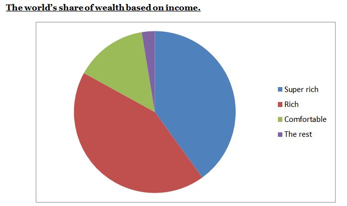
[Statistics supplied by New Internationalist 459, January – February 2013, p. 22. ]
Now let’s examine the population breakdown for these groups.
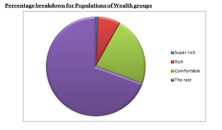
[Statistics supplied by New Internationalist 459, January – February 2013, p. 22. ]
SEE also Wealth Shares in 2011 by region, Credit Suisse Global wealth report, 2011, p. 9 and p. 14 {https://infocus.credit-suisse.com/data/_product_documents/_shop/323525/2011_global_wealth_report.pdf} ]
Less than 1 in a 100 people are super rich while only about 8 in 100 are rich. Nearly 70 in 100 people are less than comfortably off, according to these figures.
What are the consequences of these gaps, both internationally and nationally?
Here are some ‘facts and figures’; an examination of the consequences of a haves and have nots world.
Half the world’s population have total assets valued at less than $US 4,200. (Credit Suisse , Global Wealth Report, 2011, p. 9)
Half the world’s people own less than 1% of its wealth (op cit, p. 11)
At least 80% of the earth’s people live on less than $US 10 a day. (Global Issues, Poverty Facts and Stats, 2013 [http://www.globalissues.org/article/26/poverty-facts-and-stats])
The World Hunger organisation estimates that around 925 million people went hungry in 2010. (World Hunger, 2012, 2012 World Hunger and Poverty facts and statistics [http://www.worldhunger.org/articles/Learn/world%20hunger%20facts%202002.htm].)
A whole raft of ills
Apart from the obvious consequences…
